Introduction
Quality of Experience (QoE) Insights incorporate QoE analytics data and user engagement data to allow you to track and determine your audience's QoE tolerance and abandonment factors. These insights lead to actionable steps to improve user experience.
QoE insights provide Brightcove customers with easy-to-understand correlations from QoE Metrics, potential business impacts, and recommended interventions. These insights are categorized as follows:
-
QoE Tolerance:
- Help you understand when QoE metrics have an impact on user engagement
-
QoE Benchmarks:
- Provide a sense of how your QoE metrics compare with other customers
-
QoE Recommendations:
- Suggest areas for improvement based on QoE Metric thresholds and a heat map of error codes.
QoE Insights incorporate:
- QOE Analytics
- Brightcove Analytics
- Audience Insights data
Setup
QoE Insights are available to Media Video Cloud customers for an additional charge. Contact your Customer Success Manager to enable your account.
Navigation
Once your account is enabled for QoE Insights, you will find them in the Analytics module in Studio.
- Open Video Cloud Studio.
- In the primary navigation, click Analytics.
-
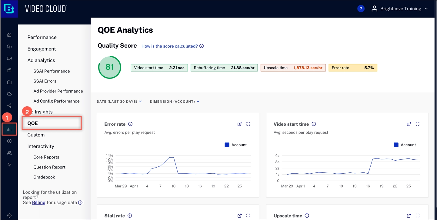
In the panel navigation, click QOE. At the top, you will see a Quality Score for your account. This feature is a part of QoE Insights
The Quality Score provides a quick reference for the user experience related to video playback.
QoE Insights
Quality Score
The Quality Score is a quick way to view customer engagement. The score is based on correlations between video playback and viewer dropoff. The colors indicate the following:
- Green - Everything looks good
- Yellow - Areas to watch
- Red - Action may be taken to improve
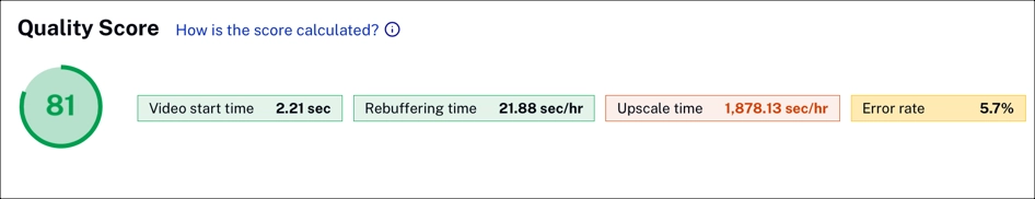
Metrics are weighted to calculate the Quality Score:
Quality Score = Video start time / 50
              + Rebuffering per min / 30
              + Upscale duration / 20
              - Percentage error rate
Time range and dimensions
Use time range and dimension to filter the data displayed in the charts below.
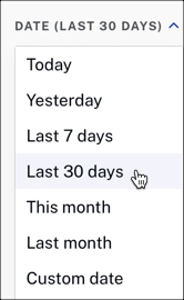
Time range selector
Click DATE to expand the dropdown menu. Select the time range for your reporting data. The charts below trend over time, based on the time range.
Dimension selector
Click DIMENSION to expand the dropdown menu. Select the measurement for your reporting data. When you select a dimension, it will be reflected in all of the charts described below.
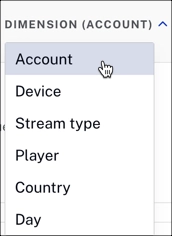
Dimensions
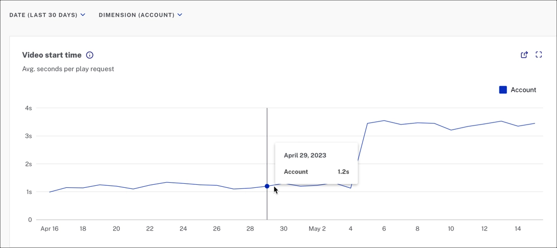
Account
The Account view provides an overall number for all streams in your account across all platforms.
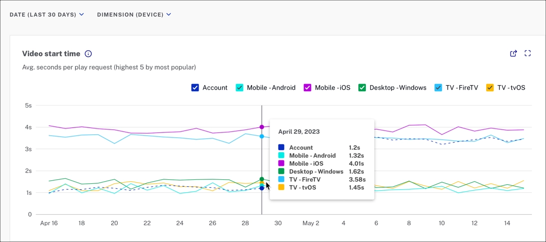
Device
The Device view makes it easier to see device-specific issues and trends over time. The example below shows a spike in error rate for Android devices that could correlate to a recent app update.
This graph shows the top 5 devices by view count, and the account level.
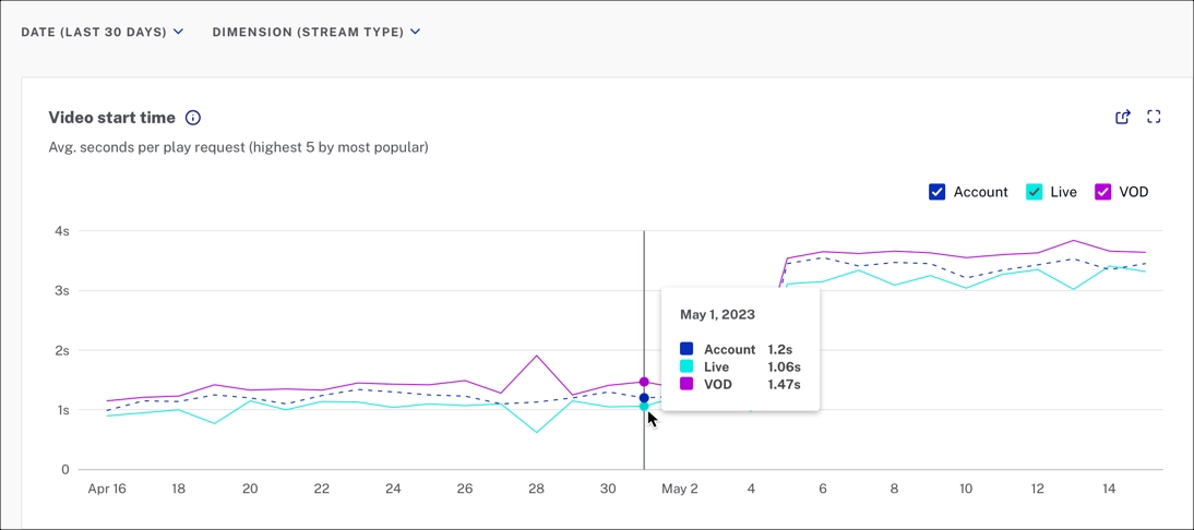
Stream type
The Stream type view compares all content in your account with VOD and Live metrics.
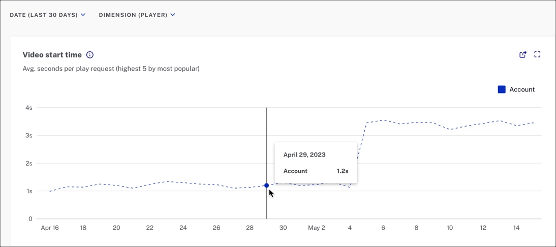
Player
The Player view shows specific players' performance and allows you to isolate and troubleshoot players where QoE is underperforming. Modifications to chunk size and buffer size can be measured using this metric.
This graph shows the top 5 players by view count, and the account level.
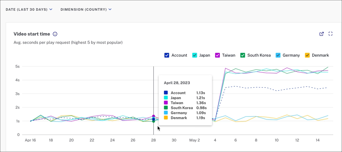
Country
For international customers, viewing QoE metrics by country can assist in isolating regional issues. In the fictional example below, the customer adopted a new content delivery network (CDN) for their Asian consumers. The chart shows that the CDN underperformed when looking at the stall rate.
This graph shows the top 5 countries by view count, and the account level.
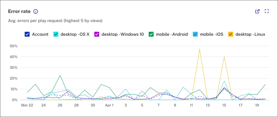
Error rate
The error rate is the number of errors reported by the player divided by the number of play requests.
Here we focus on the errors that prevent playback since some errors occur in the background without affecting the viewer experience. Brightcove Player reports errors that prevent video playback, but some of these errors happen before playback begins. Low error rates mean that viewers can watch their selected content.
This example shows the top 5 devices by view count, and the account level.
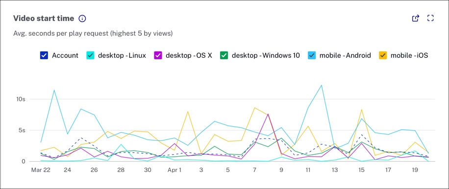
Video start time
The video start time is the average time between play request and stream start.
This metric is helpful because long load times cause abandonment before streaming starts. Long load times can point to issues with CDN, player plug-ins, and initial stream bitrate where intervention makes sense. Low video start times mean your viewers can start watching their videos quickly, which is what they expect.
This example shows the top 5 devices by view count, and the account level.
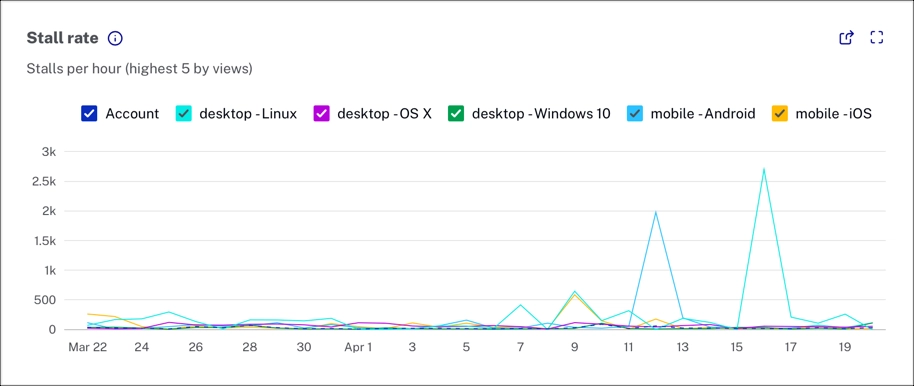
Stall rate
The stall rate is the total number of stalls divided by the total number of hours streamed.
We focus on actual video stalls instead of all rebuffering events because rebuffering may or may not impact playback, depending on the platform. Stalls affect the viewer experience, including single stalls of significant length or frequent stalls of varying lengths. Low stall rates provide smoother playback and a better viewer experience.
This example shows the top 5 devices by view count, and the account level.
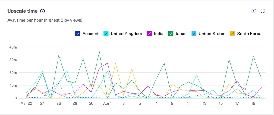
Upscale time
The upscale time is the average number of seconds per hour of viewing that is spent in an upscaled state (seconds per hour).
Upscaling occurs when a video rendition is streamed in a lower resolution than the current player size. Upscaling can result in fuzziness or video pixelation. One area where upscaling is common is when content is streamed to a 4K TV. In this case, the stream may be available at a high resolution but not encoded at 4k. While technically, this is upscaling, most viewers will not notice. Low upscaling time is associated with smooth, crisp video playback.
This example shows the top 5 countries by view count, and the account level.
Summary table
The summary table makes it easy to explore and identify anomalies.
The date range and dimensions that you set for the page, also applies to the data in the summary table. For example, if you select the Device dimension, you will see a Summary by Device.
Summary by Device
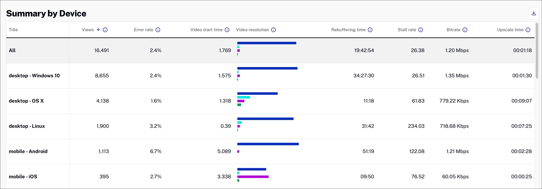
Each column is sortable. The default sort order is video views descending.
In addition to the key metrics, the summary table includes the following data:
- View count
- Video resolution breakdown
- Rebuffering time
- Avg Bitrate
For details about the column data, see the Glossary below.
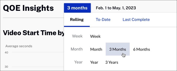
Insights time range
Use time range to filter the data displayed in the charts below.
Click 3 months to expand the dropdown menu. Select the time range for your reporting data. The charts below trend over time, based on the time range.
Abandonment rate
This chart shows the abandonment rate. The chart shows the percent of play requests where users exited before play start.
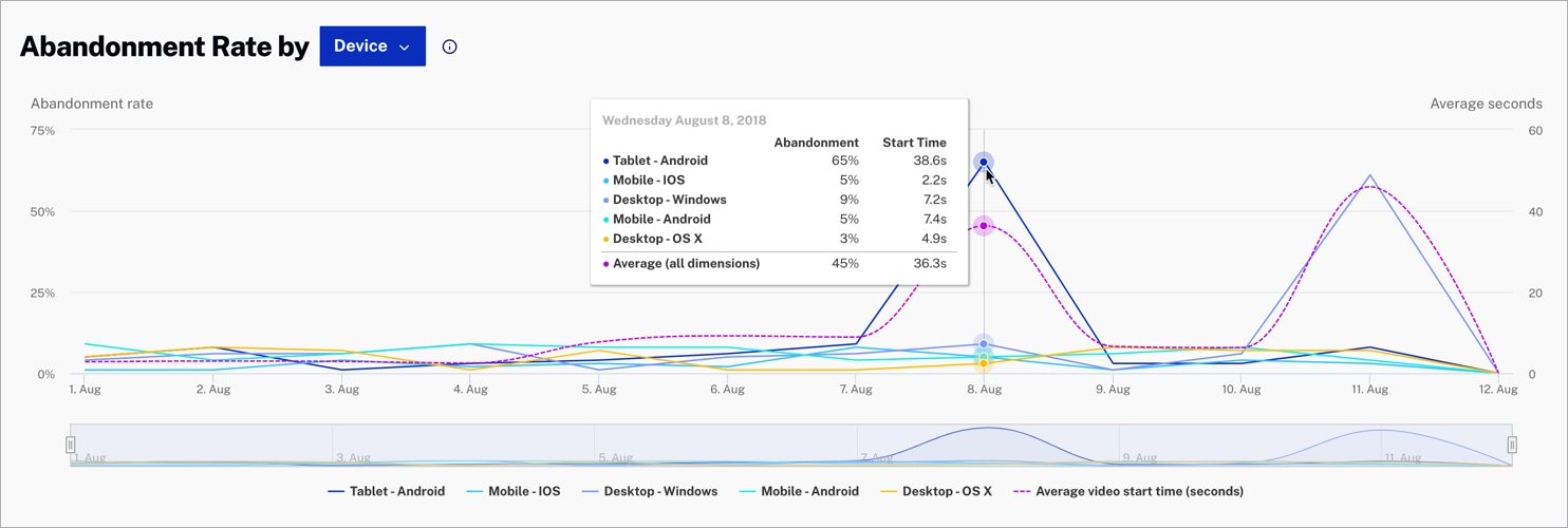
Dimension
Click Device to expand the Abandonment Rate dimension dropdown menu. Select a dimension to change the data displayed.
Error codes
This chart provides a clear view of the errors generated by the players and granular aggregations that will allow you to troubleshoot and isolate situations or specific configurations that could be worked out to improve your audience’s Quality of Experience.
The Error Code chart will allow you to visually measure the impact of the policies implemented to protect the streams and how those policies contribute to the Error rate.
This example shows the top 5 devices by view count overlayed with the average abandonment rate.
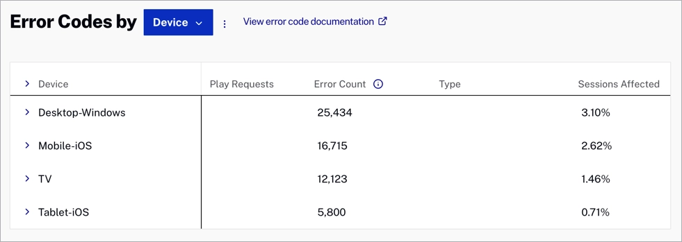
Each column is sortable. Below, you can review the Error codes data:
- Play requests- Number of play requests
- Error count- Number of counting erros
- Type- Type of error code
- Sessions effected- Percent of all sessions with a fatal error
- Top country- Countries with the highest error count
- Top device- Devices with the highest error count
- Top platform- Platforms with the highest error count
- Top OS- OS with the highest error count
- Top video- Videos with the highest error count
- Stream type- Live or VOD
Actions
Here are the actions that are available for this graph.
-
Click
 to download data as a CSV
file.
to download data as a CSV
file.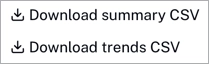
Dimension
Click Device to expand the Error codes dimension dropdown menu. Select a dimension to change the data displayed.
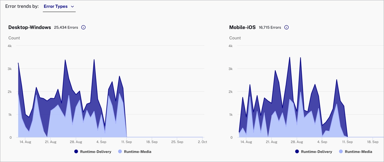
Error trends
The following graphs show the error trends filtered by device.
Actions
Here are the actions that are available for this graph.
-
Click
 to view the full graphs.
Dimension
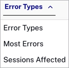
Click Error Types to expand the Error trends dimension dropdown menu. Select a dimension to change the data displayed.
Error code types
The table below lists the types of error codes.
| Type | Description | Error Codes |
|---|---|---|
| Runtime - Media | Fatal errors related to issues with media playback |
|
| Runtime - Delivery | Fatal errors related to issues with media retrieval and delivery |
|
| Policy | N/A |
|
| Service | Video Cloud-related service or authentication issues |
|
| Other | A catch-all for uncategorized errors | Unrecognized errors |
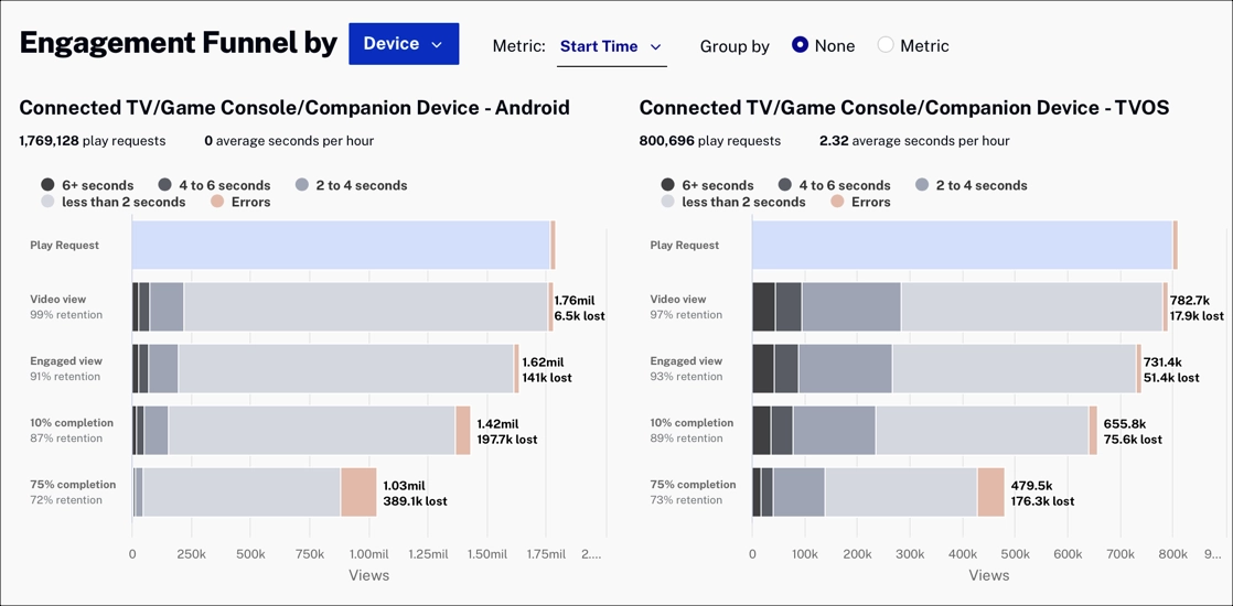
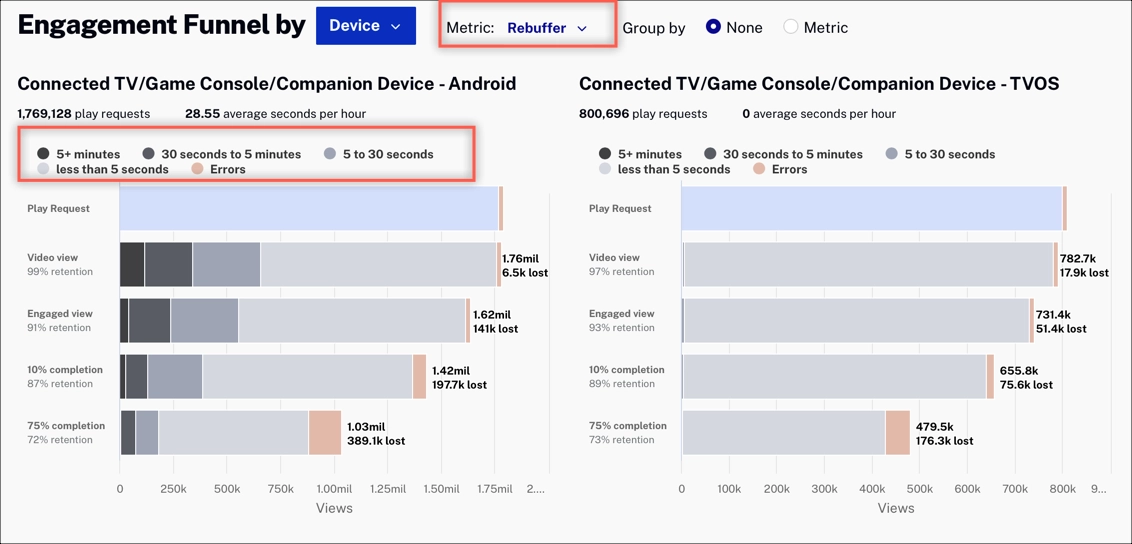
Engagement Funnel
The Engagement Funnel shows viewer engagement through various stages of video consumption. The funnel shows viewer engagement (those watching and those lost) from the play request to video view through the point of 75% video completion. The funnel lets you visualize the magnitude of lost viewers for the chosen dimension.
Dimension
Click Device to expand the Engagement Funnel dimension dropdown menu. Select a dimension to change the data displayed.
Metric
The Metric selector lets you control the buckets, which define how the data is grouped.
The example below has the Rebuffer metric selected. The colors in the funnel shows the rebuffering rate for each group:
- 5+ minutes
- 30 seconds to 5 minutes
- 5 to 30 seconds
- Less than 5 seconds
- Number of errors
If you look at the Rebuffer metric and viewer drop-off is large, you can look at the bitrate you are using and adjust it to minimize buffering.
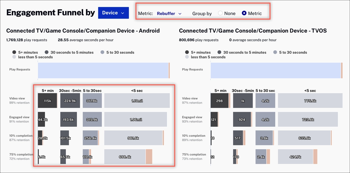
Group by
Another way to look at the data is to group by the selected metric.
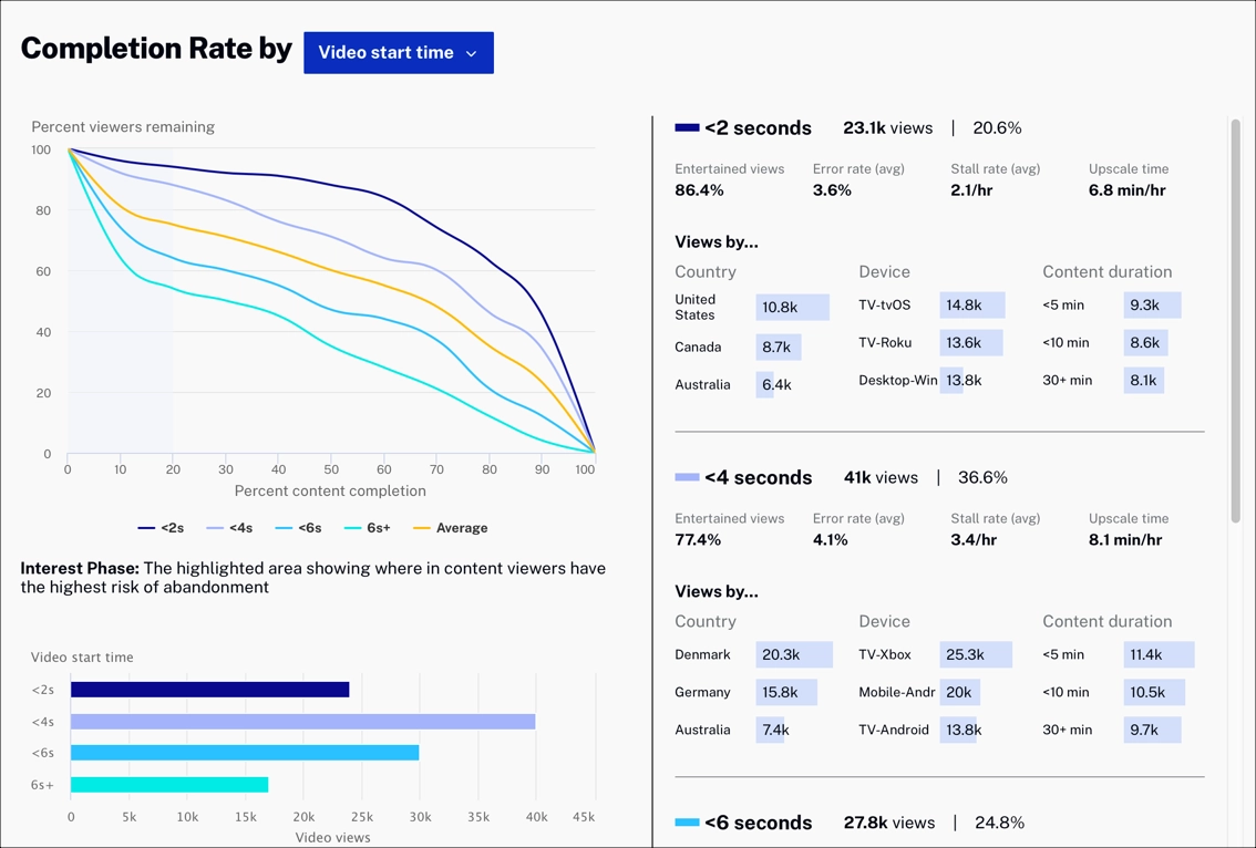
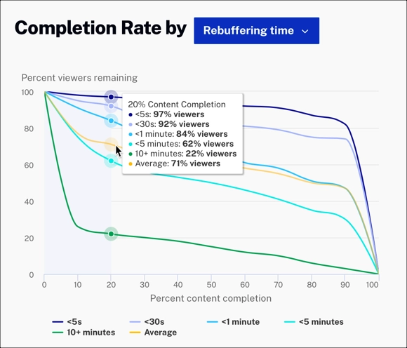
Completion Rate
The Completion Rate charts show what happens over time to viewers once they are watching a video. When video start time is high, most viewers will drop off.
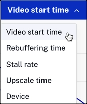
Dimension
Click Video start time to expand the Completion Rate dimension dropdown menu. Select a dimension to change the data displayed.
Example
In this example, with Rebuffering time selected, we see that most viewers decide to continue watching within the first 20 percent of the video length. Also, most viewers (97%) continue watching when the rebuffering time is less than 5 seconds.
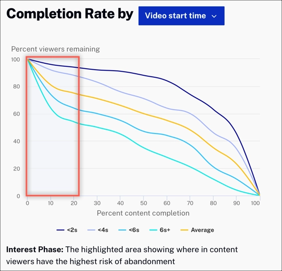
Interest Phase
The highlighted area in the graph shows that the highest abandonment rate happens within the first 20% of the video. Knowing this, you can be intelligent with your ad strategy during this timeframe. Consider varying the number of ads and the ad length to see how it affects viewer completion.
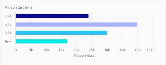
Video start time
The bar graph below shows the total number of video views based on video start time.
Completion details
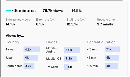
The completion details allow you to dig into what is happening within a metric time period. This example shows the following:
- When the re-buffer rate is between 1 and 5 minutes, only 14.1% of viewers watch at least 75% of the video length (considered complete)
- There are 76.6K total views
- Average error rate is 6.9%
- Average stall rate is 12.5/hr
- Upscale time is 3.7min/hr
- Top views by country, device, and content duration